A Complete Guide to Analyzing Case Interview Graphs & Charts
Author: Taylor Warfield, Former Bain Manager and interviewer
Last Updated: June 2, 2026

Case interview graphs and charts test one thing: whether you can look at a dense exhibit and pull out the two or three data points that actually move the case forward. You are almost guaranteed to see a few of them in your interview.
Reading off every number is the fastest way to fail. Drawing the right insight and connecting it to the case is how you pass.
By the end of this article, you'll know a six step method to analyze any exhibit, the 10 most common chart types you'll face, how long to spend on each one, a worked example with sample dialogue, and the mistakes that get most candidates rejected.
But first, a quick heads up:
McKinsey, BCG, Bain, and other top firms accept less than 1% of applicants every year. If you want to triple your chances of landing interviews and 8x your chances of passing them, watch my free 40-minute training.
Why Do Case Interviews Use Graphs and Charts?
Case interviews use graphs and charts to test whether you can interpret data under time pressure and turn it into a business decision. This is the exact skill consultants use every day when a partner hands them a slide and expects a quick read on what matters.
Charts test something different from case math or case structuring. Math tests calculation speed and accuracy, while structuring tests how you break down a problem. Charts test your judgment about which numbers matter and what they mean for the client.
In my experience interviewing at Bain, charts were one of the most discriminating parts of the case. Most candidates have built charts in school but have never been trained to read one quickly and say something useful about it.
What Do Interviewers Actually Score When You Analyze a Chart?
Interviewers score four things when you analyze an exhibit. They are not grading whether you can read the numbers. They are grading whether you can find the insight and explain why it matters.
The four things interviewers look for are:
- Relevance: Did you pick the two or three data points that matter for the case, or did you get lost in noise?
- The “so what”: Did you turn a number into a business implication, or did you stop at describing it?
- Communication: Did you lead with the insight, or did you bury it inside a long description?
- Next steps: Did you connect the insight to the case objective and propose where to go next?
How Do You Analyze Case Interview Graphs and Charts?
There are six steps to read and interpret any case interview exhibit. Follow them in order and you'll get faster and sharper at analyzing charts with every practice case.
The six steps are:
- Read the chart or graph title
- Look at the axes, units, and labels
- Identify the one or two biggest insights
- Identify the less obvious insights
- Connect the insights to the case objective
- Summarize what you have found
Step 1: Read the Chart or Graph Title
The first step is to get an overall understanding of what the chart is showing. The most efficient way to do this is to read the title before you look at anything else. This reveals exactly what data is being presented.
Step 2: Look at the Axes, Units, and Labels
Now that you broadly know what data is being presented, look at the axes. Most charts have two axes, the x-axis and the y-axis.
The axes tell you what dimensions of information are shown. They also show the units of measurement, which you should pay close attention to. Numbers are not useful if you don't know what the units are.
Finally, look at any other labels, such as a legend, key, or footnotes. The goal of this step is to orient yourself on how the chart is structured so it's easier to read.
Step 3: Identify the One or Two Biggest Insights
Next, focus on the one or two biggest insights that immediately stand out. There are a few common patterns you should recognize as you practice.
The patterns to look for are:
- One number is much smaller or larger than the others
- One number is increasing or decreasing much faster or slower than the others
- The data shows a clear trend, either up or down
- There is a correlation between two variables
Many candidates make the mistake of reading off every number the chart shows. Reading text out loud does not get you any points. Interpreting what you read to draw insights is what matters.
Step 4: Identify the Less Obvious Insights
After you identify the one or two biggest insights, take time to find other important but less obvious ones. These are the insights that separate outstanding candidates from average candidates.
The less obvious insights usually require:
- A calculation, such as a growth rate or a percentage change
- Comparing the chart data with information you already have about the case
- Comparing data across two or more exhibits if you have been given multiple
Step 5: Connect the Insights to the Case Objective
Now that you have your insights, answer the question “so what?” How does this insight help you solve the case or build a recommendation? This is what distinguishes outstanding candidates from average ones.
The insights from the chart should help you develop a hypothesis for what the answer to the case could be. If you already had a hypothesis, the chart should help you confirm or refine it.
Step 6: Summarize What You Have Found
Depending on how complex the chart is, you may find it helpful to summarize everything you have done in a structured way.
Summarize using this structure:
- State what the chart shows
- List the biggest insights you drew from it
- Explain how these insights affect your hypothesis or answer
- Propose the next steps to solve the case
How Long Should You Spend Analyzing a Chart?
You should spend roughly 30 to 60 seconds quietly studying an exhibit before you start talking, and 2 to 3 minutes in total to fully analyze and communicate your insights. Going silent for longer than 60 seconds makes interviewers nervous, while rushing in immediately leads to surface-level reading.
The single biggest differentiator is taking a deliberate pause to think before you speak. Candidates who rush read off numbers. Candidates who think for 30 to 60 seconds deliver insights.
It's completely acceptable to ask the interviewer for a moment to review the exhibit. A simple “Do you mind if I take a moment to look at this?” buys you thinking time and signals composure.
Budgeting 2 to 3 minutes per chart is part of your overall case interview timing, and going over on one exhibit leaves you no time for a clean recommendation.
How Do You Communicate Insights From a Chart?
Communicate your chart insights top-down. Lead with the single most important takeaway, then support it with the data, then explain the implication for the case. This is the same structure consultants use to brief clients and partners.
A clean way to phrase an insight is: “The key takeaway is X. We can see this because of Y in the data. This matters because Z for our client.”
Here's an example. Instead of saying “Revenue went up from 2023 to 2024,” say “The key insight is that revenue growth is concentrated almost entirely in one region, which creates geographic risk if that market slows. I'd want to look at whether we can diversify.”
The first version is a description. The second version is an insight with a so what and a next step. That difference is what gets scored.
How Do You Spot Relevant, Irrelevant, and Misleading Data?
Not every number on a chart matters. Interviewers deliberately include data that is relevant, data that is irrelevant, and data that is misleading. Your job is to tell them apart quickly.
Type of data |
What it is |
How to handle it |
Relevant |
Directly tied to the case objective, such as the profit driver you're investigating |
Lead with it and build your so what around it |
Irrelevant |
Real but unrelated to the question, such as a metric for a segment you don't care about |
Acknowledge it briefly, then set it aside |
Misleading |
Data that looks important but distorts the picture, such as a truncated axis or a percentage with no base |
Check the scale and base before drawing any conclusion |
The most common trap is a misleading axis. A y-axis that starts at 90 instead of 0 makes a tiny change look dramatic. Always confirm where the axis starts before you call something a big jump.
The second most common trap is a percentage with no base. A segment growing 50% sounds huge until you learn it started at $2 in revenue. Anchor every percentage to an absolute number.
What Are the 10 Most Common Charts and Graphs in Case Interviews?
There are 10 chart types that show up again and again in case interviews. Once you recognize each one on sight, you can skip straight to finding insights instead of figuring out how to read the chart.
The 10 most common chart types are the simple bar chart, stacked bar chart, 100% stacked bar chart, Mekko chart, pie chart, waterfall chart, histogram, line graph, scatterplot, and bubble chart.
1. Simple Bar Chart
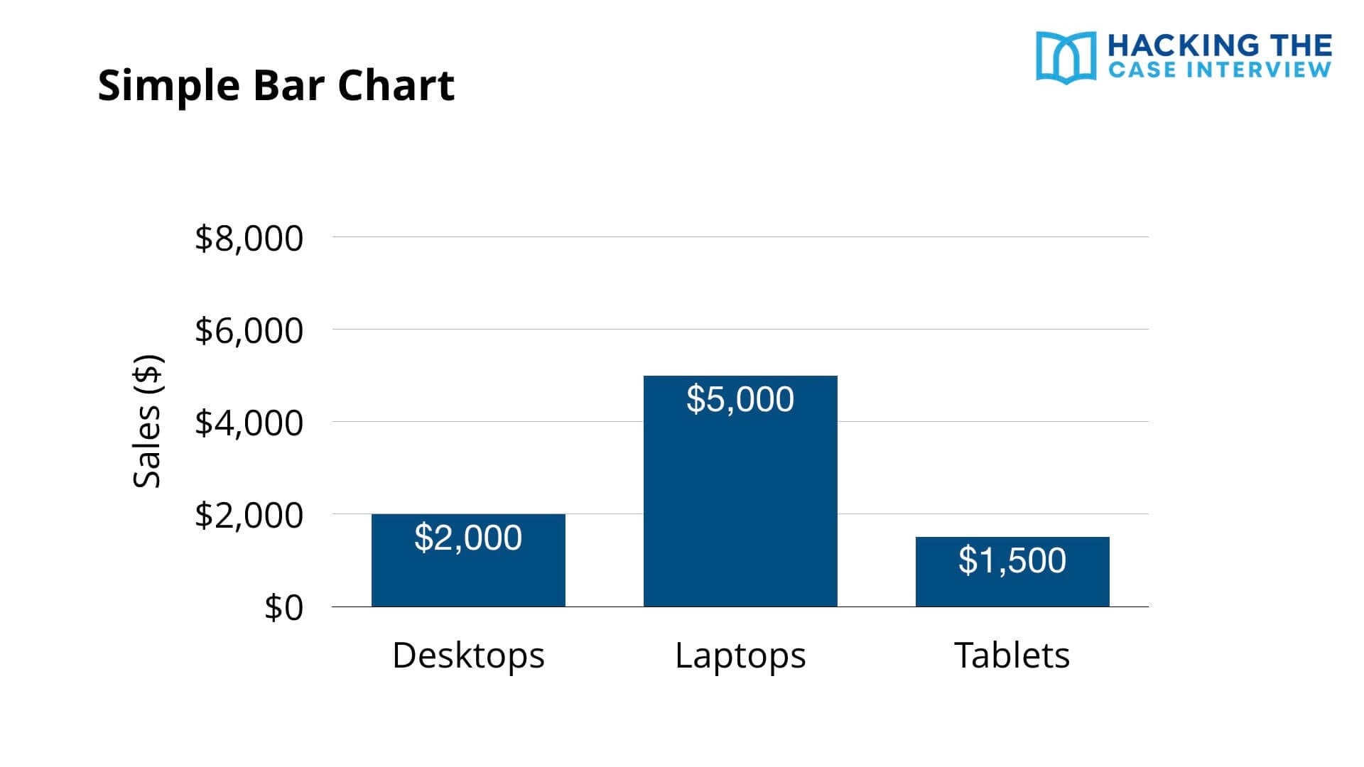
One of the simplest charts is the bar chart. In this example, the x-axis represents different products, including desktops, laptops, and tablets, while the y-axis represents sales in dollars. The height of each bar represents the sales for each product.
Simple bar charts are straightforward to read since they don't show much information. In this example, we can conclude that laptops have the highest sales at $5,000 and tablets have the lowest at $1,500.
2. Stacked Bar Chart
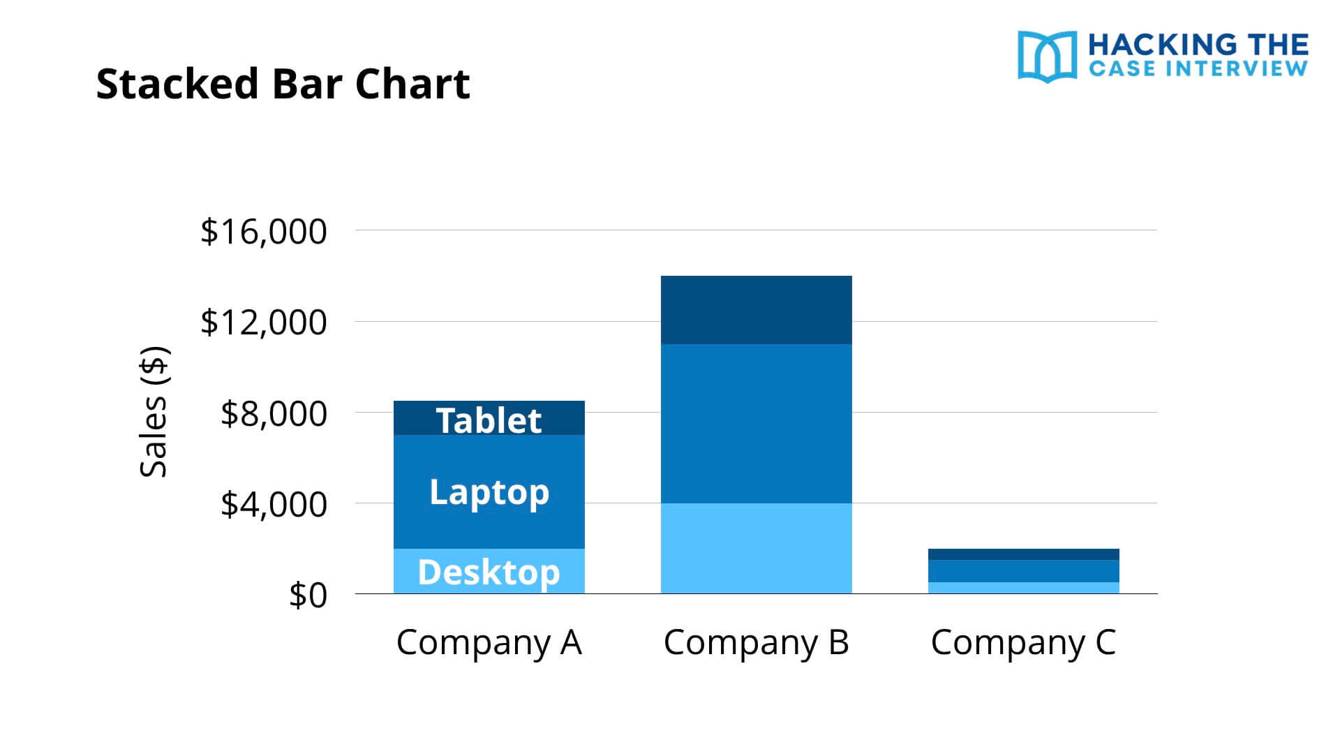
A stacked bar chart adds another dimension of data to a simple bar chart.
In this example, the x-axis represents different companies and the y-axis represents sales in dollars. The stacked segments in each bar represent the type of product. So this chart shows the sales of different products by company.
We can conclude that Company B has not only the highest sales overall, but also the highest sales in each of the three product categories.
3. 100% Stacked Bar Chart
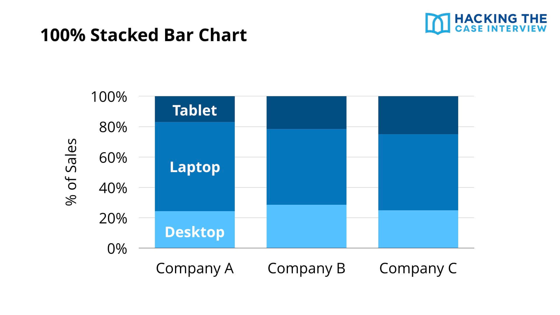
A 100% stacked bar chart transforms the y-axis of a stacked bar chart.
Instead of the y-axis being sales in dollars, it's now sales as a percentage of total sales for that company. The x-axis still represents the company and the stacked segments still represent products.
The advantage is that you can easily compare the relative proportion of a segment in one bar with that same segment in another. Here, Company B has the highest proportion of sales from desktops and Company C has the highest proportion from tablets.
4. Marimekko or Mekko Chart
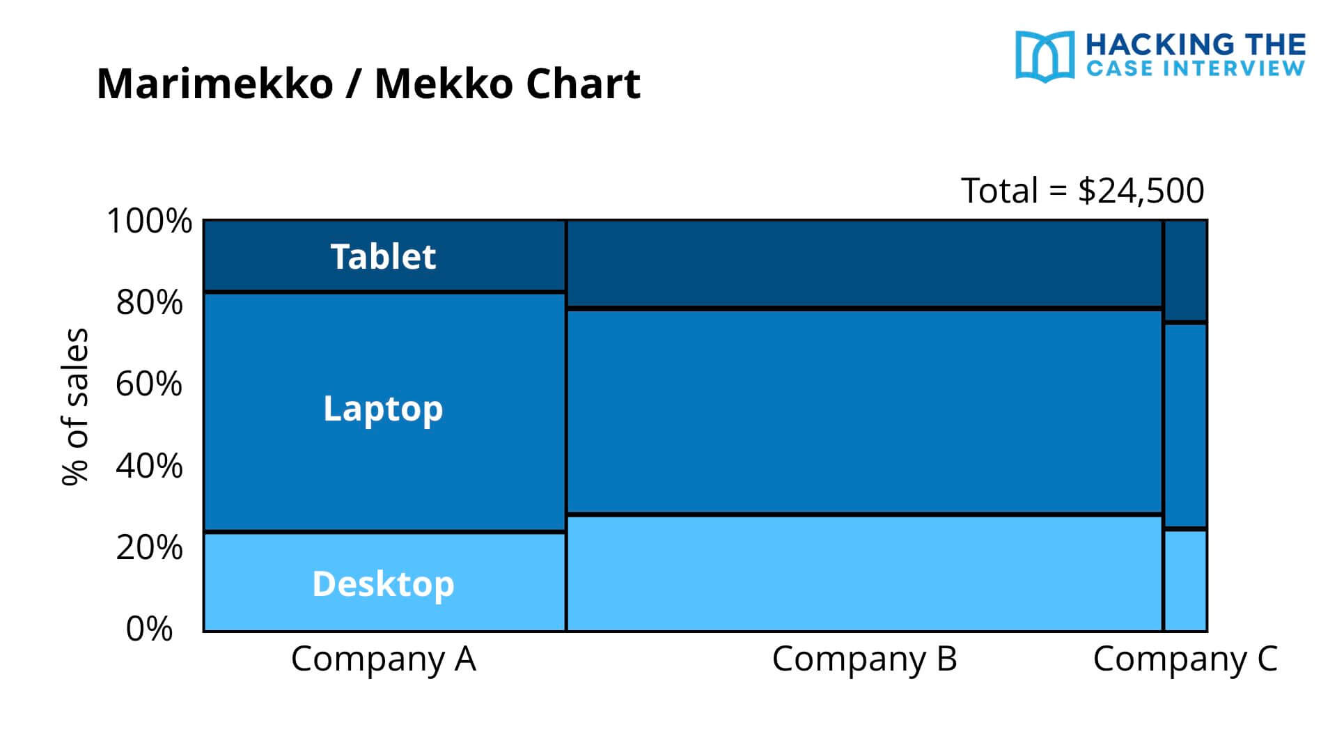
The Marimekko or Mekko chart adds yet another dimension of data to the 100% stacked bar chart. This chart is heavily used by Bain and can confuse candidates who have never seen it.
The x-axis represents the different companies, the y-axis represents the percentage of total sales, and the stacked segments represent the different products. The new dimension is the width of each bar, which shows how large total sales are across companies.
You can think of a Mekko chart as a large, rectangular pie chart. In this example, the entire rectangle represents $24,500 of sales across all three companies. Each individual rectangle represents a percentage of that total.
Like a 100% stacked bar, you can compare the proportion of a segment across bars. The proportion of tablet sales is highest in Company C since its tablet segment is the tallest.
Unlike a stacked bar, you can also compare the size of one entire bar with another. Company B has the highest overall sales since its bar is the widest.
5. Pie Chart
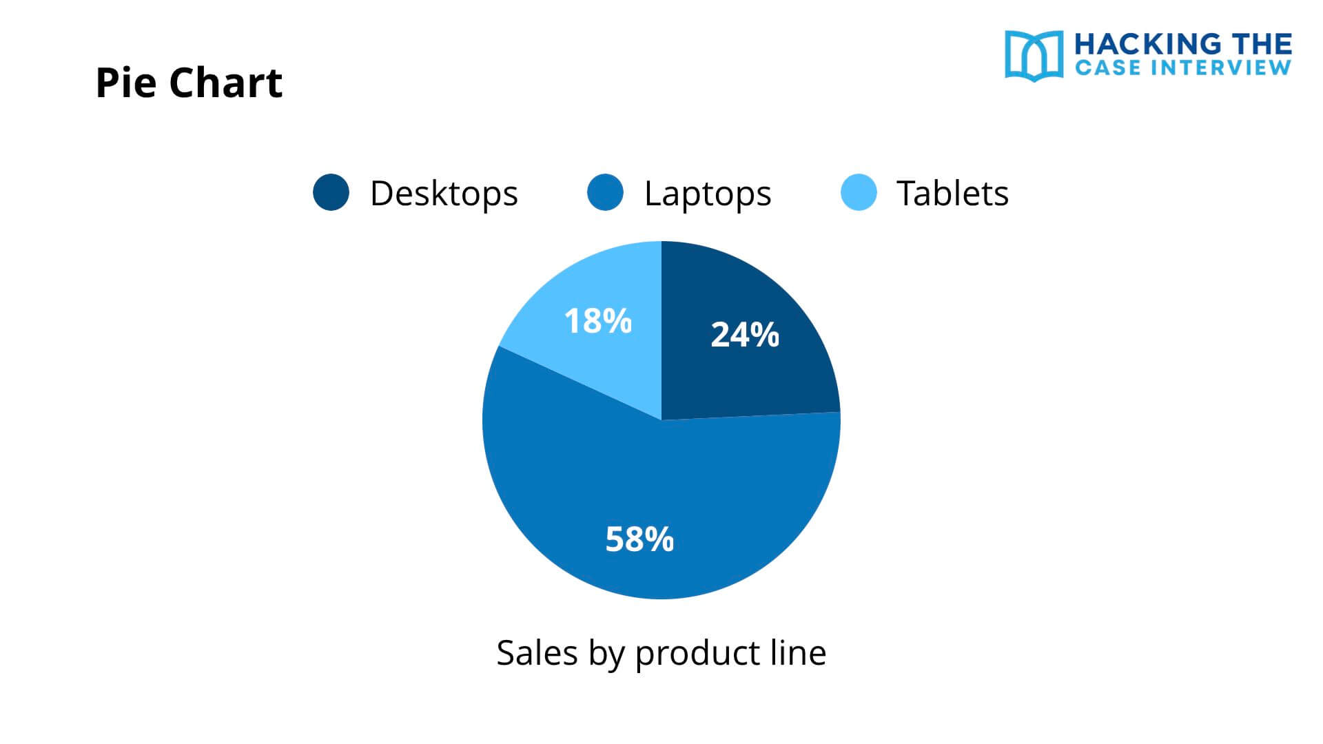
The pie chart is heavily used by the Boston Consulting Group. A pie chart shows the same information as a 100% stacked bar chart.
In this example, the pie chart represents 100% of sales by product line. Each slice represents the proportion of total sales that each product category accounts for.
6. Waterfall Chart
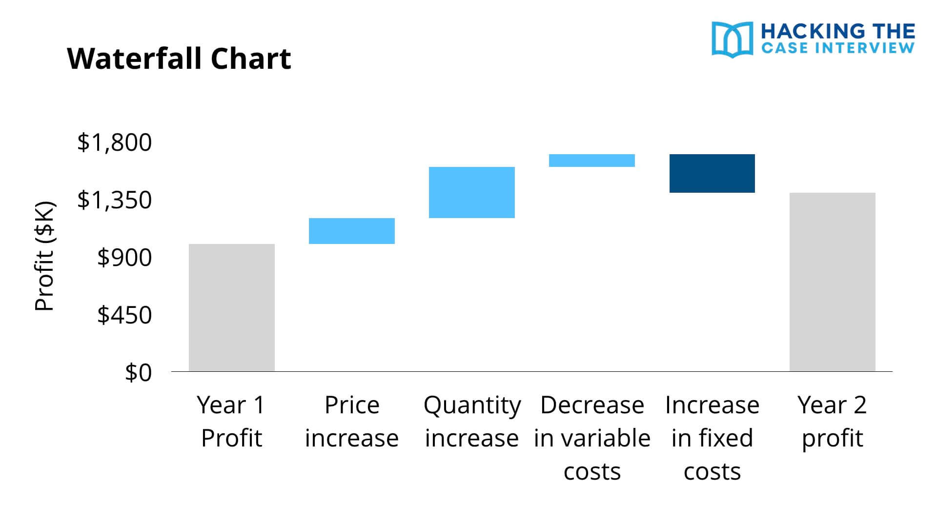
A waterfall chart shows how you get from one number to another number.
In this example, the chart shows how we get from year one profit, the first bar on the left, to year two profit, the last bar on the right. Profit increased from year 1 to year 2. The chart shows what caused the increase.
The bars in light blue show drivers that increased profits. A price increase, a quantity increase, and a decrease in variable costs all pushed profits up. The bar in dark blue shows the one driver that decreased profits, an increase in fixed costs.
The largest driver behind the profit increase is the quantity increase, because that is the largest bar. Waterfall charts show up constantly in profitability cases, so it pays to recognize them instantly.
Waterfall charts are central to the profitability case interview, where you break profit down into its revenue and cost drivers.
7. Histogram
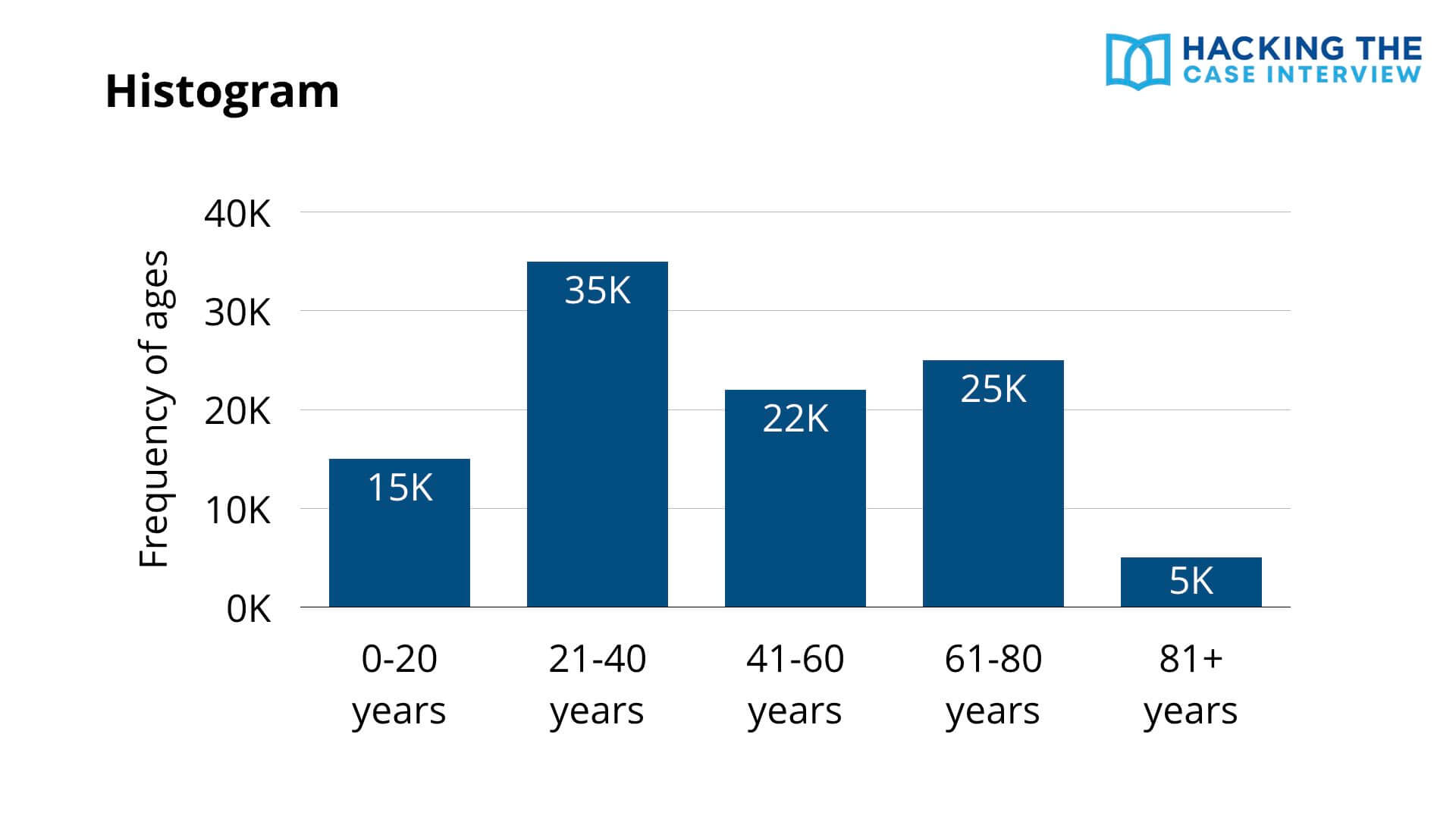
A histogram may look like a simple bar chart, but it's quite different. A histogram shows the distribution of a variable. A bar chart compares a variable across categories.
In this example, the x-axis represents different age groups and the y-axis shows the frequency of each group. We can conclude that the 81+ age group has the fewest people and the 21 to 40 age group has the most.
8. Line Graph
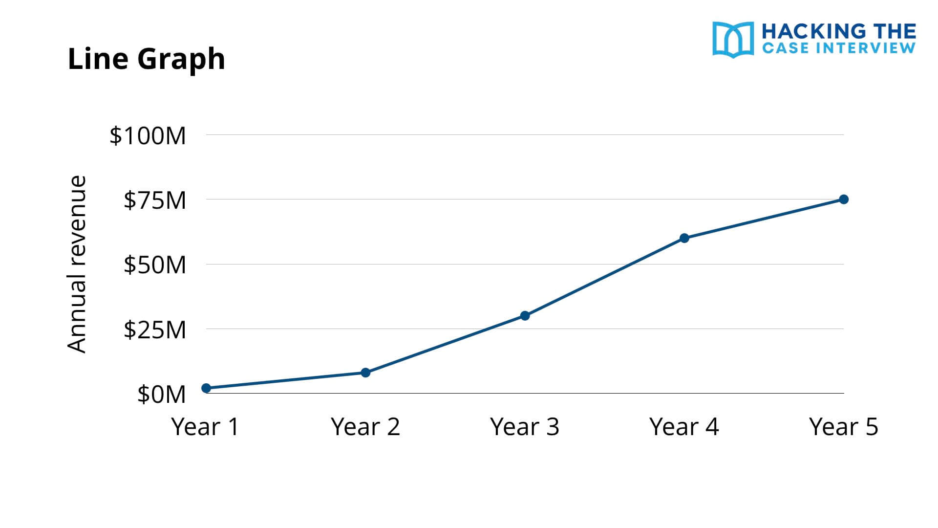
A line graph shows the change in a variable over time. Time is almost always on the x-axis.
In this example, the x-axis shows years and the y-axis shows annual revenue. The graph shows how annual revenue has changed over five years. When you see a line graph, look for trends, inflection points, and any segment where the slope suddenly changes.
9. Scatterplot
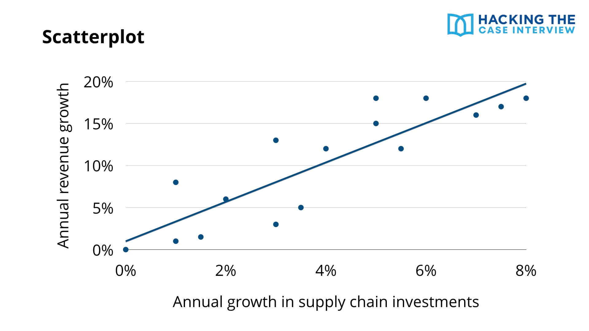
A scatterplot shows points to visualize the values of two different variables, labeled on the x-axis and y-axis.
In this example, the x-axis represents annual growth in supply chain investments and the y-axis shows annual revenue growth. As supply chain investment growth increases, revenue growth increases. A trendline shows this correlation.
You can use trendlines to make predictions. If a company's annual growth in supply chain investments is 10%, its annual revenue growth would be greater than 20%.
10. Bubble Chart
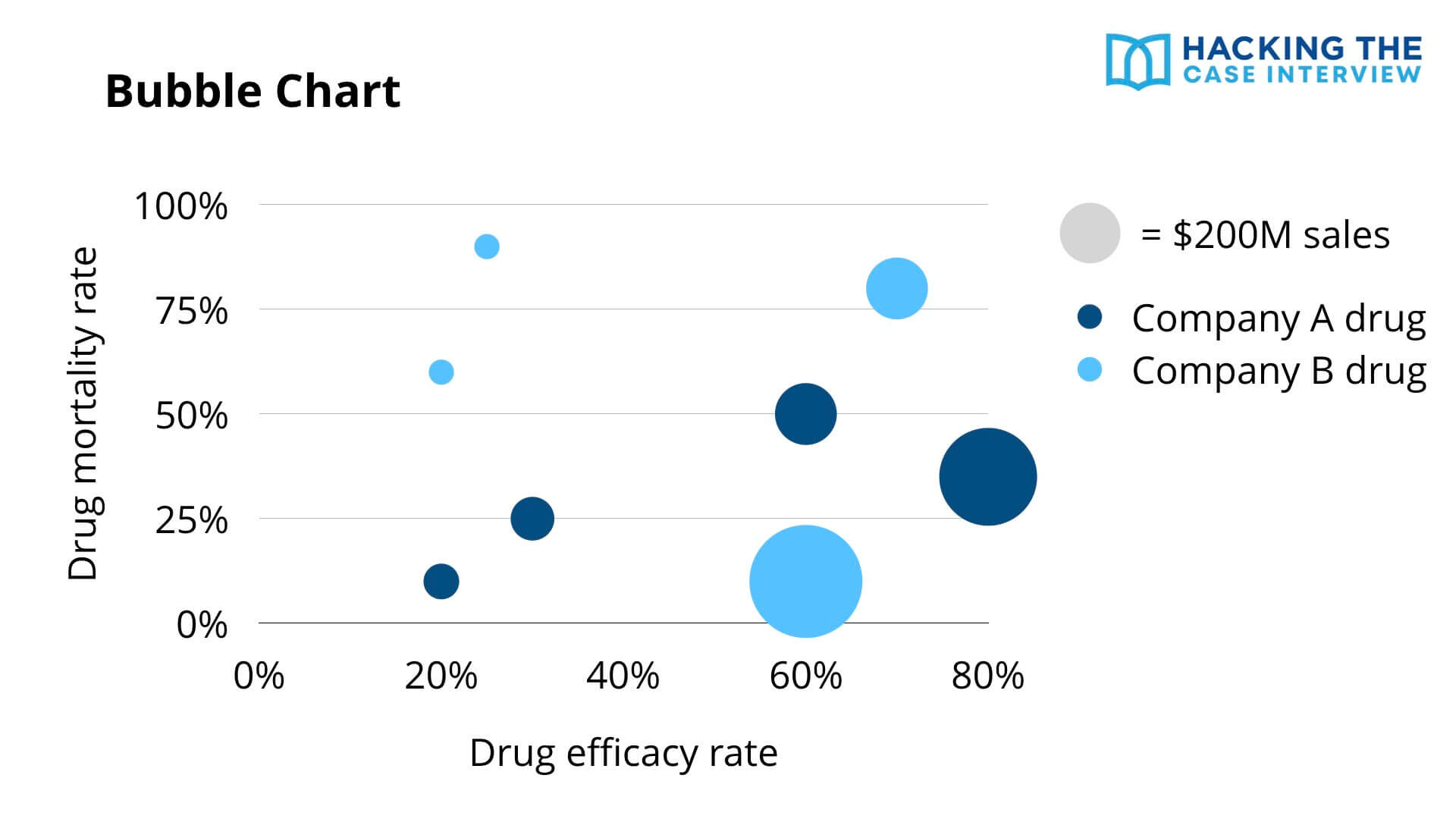
Bubble charts show many dimensions of information at once. They use the x-axis, y-axis, size of the bubble, and color of the bubble to show data.
In this example, each bubble represents a different drug. The x-axis shows drug efficacy, the y-axis shows mortality rate, the size of the bubble shows sales in dollars, and the color indicates which company the drug belongs to.
With bubble charts, identify which quadrant is the most favorable. Here, drugs with high efficacy and low mortality are best. Looking at that quadrant, Company A has two drugs there while Company B has one, but Company B owns the single highest-selling drug.
Recognizing and analyzing these chart types fast comes down to repetition. If you want to learn case interviews quickly, my case interview course walks you through proven strategies in as little as 7 days.
What Does a Worked Chart Example Look Like?
Here's a worked example so you can see the full method in action, from first glance to so what. Let's say you're working a profitability case for a coffee chain whose profits have fallen, and the interviewer hands you a waterfall chart.
The chart breaks down the change in profit from last year to this year. It shows revenue up slightly, store rent up sharply, and labor costs up moderately, ending in a net profit decline.
Here is how a strong candidate would talk through it:
You: “Do you mind if I take a moment to review this?”
Interviewer: “Go ahead.”
You (after 30 to 45 seconds): “The key insight is that the profit decline is driven almost entirely by rising store rent, not by a revenue problem. Revenue actually grew slightly. Rent is the single largest negative driver on the chart, larger than the increase in labor costs. This tells me the issue is on the cost side, specifically real estate. I'd want to look next at whether rent increases are concentrated in certain locations or across the whole portfolio, since that changes whether we renegotiate leases or close underperforming stores.”
Notice what happened there. The candidate led with the insight, supported it with the chart, explained the so what, and proposed a clear next step. They never read off a single raw number for its own sake.
If the chart requires a calculation to surface the insight, stay fast and clean with your case interview math so you don't lose momentum mid-analysis.
What Are the Most Common Chart Analysis Mistakes?
The most common chart analysis mistakes are reading off every number, stopping at the description instead of the so what, and analyzing the chart without tying it to the case objective. Avoiding these three alone puts you ahead of most candidates.
The mistakes I saw most often as an interviewer were:
- Reading every data point: Narrating the whole chart out loud. The interviewer can already read it. Pick the two or three points that matter.
- Stopping at the description: Saying “revenue went up” and then going quiet. Every observation needs a so what.
- Ignoring the objective: Analyzing the chart in a vacuum instead of asking how it helps solve the case.
- Misreading units or scale: Missing a truncated axis, a log scale, or a units label like “in thousands.”
- Skipping footnotes: Footnotes and legends often hold the context that makes the chart make sense.
- Speaking before thinking: Talking immediately and then walking back your conclusion. Take the 30 to 60 second pause.
- Going silent too long: Staring at the chart for two minutes with no narration. If you need time, narrate what you're noticing.
What If You Get a Chart You've Never Seen Before?
If you get an unfamiliar chart, don't panic. The six step method works on any exhibit. Start with the title, axes, units, and labels, then orient yourself before looking for insights.
It's also fine to ask a clarifying question about the chart's structure. Asking “Just to confirm, the bubble size represents revenue, correct?” shows the interviewer you're being careful, not lost.
Most unfamiliar charts are just combinations of the 10 types above. A complex exhibit is usually a bar chart with an extra dimension or a scatterplot with a third variable layered on. Break it into the parts you recognize.
How Do You Practice Chart Interpretation?
The fastest way to improve is a daily exhibit drill. Find one chart per day from a business publication, an annual report, or an infographic, set a 45 second timer, and force yourself to say the single most important insight out loud using the top-down structure.
Do this for two weeks and your speed will jump. The skill is pattern recognition, and pattern recognition comes from volume.
You should also practice with full cases, not just isolated charts. In a real case, the chart appears mid-conversation and you have to connect it to everything you already know. Practicing in context is what builds the connection muscle.
Chart interpretation also shows up in screening tools beyond live interviews. Tools like the McKinsey Solve assessment test your ability to read data quickly under time pressure, so the same drills help you there too.
How Are Charts Tested in Digital and AI Case Formats?
Digital assessments and AI-led case formats test chart interpretation differently from live interviews. Instead of talking through an exhibit with a person, you often select answers, type insights, or respond to follow-up prompts from software.
The McKinsey Solve assessment, for example, puts data interpretation inside game-like scenarios where you analyze information under a strict clock. Only about 20% of candidates pass.
The underlying skill is identical. You're still spotting the relevant data, drawing the insight, and connecting it to a goal. The format just removes the conversation, which means your reasoning has to be right the first time with no interviewer to redirect you.
Frequently Asked Questions
How long should I spend analyzing a chart in a case interview?
Spend 30 to 60 seconds quietly studying the chart before you speak, and 2 to 3 minutes total to analyze and communicate. Pausing to think before talking is the biggest differentiator between candidates who deliver insights and those who just read numbers.
Do I need to do math on case interview charts?
Sometimes. Do a calculation only when it surfaces a real insight, such as a growth rate or a percentage change. Avoid long calculations that don't inform your analysis, since they waste time and add no value.
What if I can't find any insight in the chart?
Go back to the case objective and ask what the chart is supposed to help you decide. If you still can't see it, narrate what you do observe and ask a clarifying question. Interviewers prefer a candidate who reasons out loud over one who freezes.
What chart types are most common in case interviews?
Bar charts, stacked bar charts, line graphs, pie charts, and waterfall charts are the most common. Bain frequently uses Mekko charts and BCG often uses pie charts, so learn to recognize those on sight.
How do I communicate a chart insight clearly?
Lead with the takeaway, support it with the data, then explain why it matters for the client. A clean format is “The key insight is X, we can see this from Y, and it matters because Z.”
What is the most common mistake when analyzing charts?
Reading off every number instead of picking the two or three that matter. The interviewer can already read the chart. You're scored on which data points you choose and what business implication you draw from them.
Can I ask the interviewer for time to review a chart?
Yes. Asking for a moment to study the exhibit is expected and signals composure. Just keep it under 60 seconds, and narrate your thinking if you need longer so you don't go silent.
Everything You Need to Land a Consulting Offer
Need help passing your interviews?
-
Case Interview Course: Become a top 10% case interview candidate in 7 days while saving yourself 100+ hours
-
Fit Interview Course: Master 98% of consulting fit interview questions in a few hours
- Interview Coaching: Accelerate your prep with 1-on-1 coaching with Taylor Warfield, former Bain interviewer and best-selling author
Need help landing interviews?
- Resume Review & Editing: Craft the perfect resume with unlimited revisions and 24-hour turnaround
Need help with everything?
- Consulting Offer Program: Go from zero to offer-ready with a complete system
Not sure where to start?
- Free 40-Minute Training: Triple your chances of landing consulting interviews and 8x your chances of passing them